I was thrilled to hear from Sorrell Downing at Events by Sorrell last spring! Sorrell was putting together a rehearsal dinner and was in need of a colorful crest invitation in watercolor. Two of my favorite projects-florals and crests! And of course I was happy to mix it up and create something for a rehearsal dinner this time. Sorrell does the most spectacular events so I was thrilled to hear from her!
The color scheme was to be yellows, spring green, and oranges. Sorrell gave me an image of some florals that would be used at the event, and just let me do my creative thing!!
The crest was painted first. When I paint a crest, it is always oversized (typically 8" x10") so I can then shrink it down and pull floral designs to use on the other desired pieces. There are so many shapes to use for a crest. I always like to think about how the florals will lay out, and where I want to place color. One little secret ;). Before I start painting, I draw it all out in pencil. The design and basic layout takes me a lot of time. Figuring out placement and how to make the flowers work for other pieces is a big part of the process for me.


There are so many possibilities after a crest is created. In this case, we used it on the invitation, then on custom napkins, at the top of the seating chart, and on the menu cards placed at the seat of each guest.
In the invitation suite, I painted a leafy border for the reply cards. Then some of the florals were used to create a soft and beautiful envelope liner. One of my favorite details that you can see on all of our invitations is our signature "artwork on the envelope". It's a sweet and unexpected addition every time. The digital calligraphy style used on the invitation was Carie style, with names in Caitlin. We carried those styles through on the menus and seating chart also.
The menus had a few special touches. Each guest's name was at the top of the menu to specify their seat. The menu was also illustrated! That is a trend that I really hope stays around for awhile. We have so many great paintings of different foods. It's really a special detail to bring color and personality to your wedding table. From a chicken, to fresh spices, veggies, and blueberries, these fun details really add something unique to the table design.
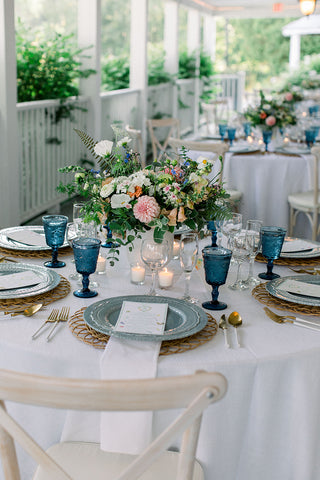
Sorrell's tables were really something to behold (as always)! I love the way it all came together with the selected colors, floral centerpieces, plates and flatware, and especially the blue goblets! Stunning! And all the beautiful photos in this gallery were taken by Kate Preftakes. What a great team! I really feel honored to have been a part of this celebration. Thank you, Sorrell, for thinking of me for this fun project.
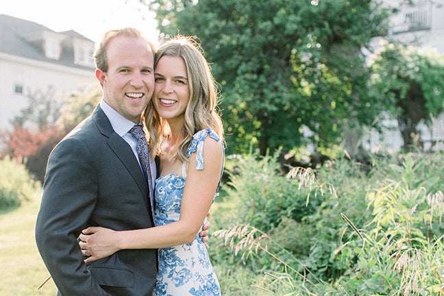
Congratulations and Best Wishes to Brendan and Natasha! It looks like it was a perfect evening-kicking off your wedding celebration!
Planning and Design-Events by Sorrell
Photographer- Kate Preftakes
Venue-Sunset Hill House
Flowers by Tarrnation flowers